21 Oct The Power of Color: Understanding and Harnessing Color Theory
Color theory goes beyond selecting visually pleasing colors—it’s about understanding how color impacts perception, behavior, and mood, playing a crucial role in branding, marketing, and design.
What is Color?
Color is the result of light reflecting or emitting from objects. Our eyes perceive colors that are reflected while absorbing others. Sir Isaac Newton first demonstrated this in 1666 when he passed sunlight through a prism, breaking it into visible colors.
Primary and Secondary Colors
In traditional color theory, the three primary colors are red, yellow, and blue—these cannot be created by mixing other colors. Mixing these yields secondary colors: orange, green, and purple.
Color Models
A color model is a system that helps us to define and describe colors through numerical values. There are many types of color models that use different mathematical systems to represent colors, although most color models typically use a combination of three or four values or color components.
Some popular color models used across the design industry are:
RGB (Red, Green, Blue)
HSL (Hue, Saturation, Lightness)
CMYK (Cyan, Magenta, Yellow, Black)
CIE
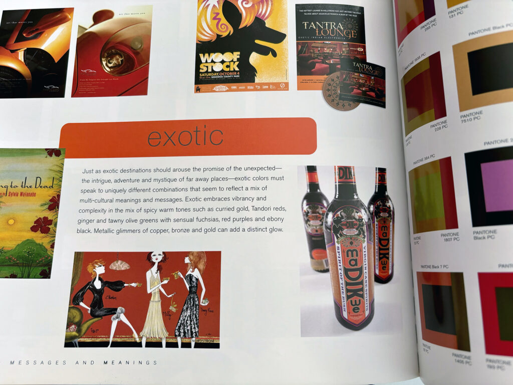
Pantone® Color Reference Systems

RGB Color Model
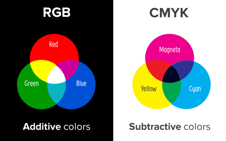
The RGB model is designed for digital screens like computers and phones. It works by assigning a value from 0 to 255 to each primary color: Red, Green, and Blue. These values control the intensity of each color component. The RGB model is additive, meaning colors get lighter as you mix them, and combining all three in equal amounts creates white light.
CMYK Color Model
CMYK is primarily used for printing. It represents colors as percentages of four inks: Cyan, Magenta, Yellow, and Black. This model is subtractive, meaning colors get darker as they mix. When printed, inks subtract varying wavelengths of light to produce color, with the full combination resulting in near black.
The CMYK model ensures accurate color reproduction in print, often referred to as process color or four-color printing.
A printing machine creates images by combining CMYK colors to varying degrees with ink. When preparing a color image for printing, the prepress operator makes four separation plates. Each plate is for one of the four colors of ink in the CMYK model. When all four plates are aligned and printed on top of each other, the inks will combine to simulate the proper colors. This method is referred to as “process color” (or “four-color”) printing.
I have a very deep understanding of color separation, and the printing process.
What is Spot Color?
Spot Color Printing involves using specific, pre-mixed inks rather than blending colors through the CMYK process. Unlike process printing, which relies on overlapping dots of cyan, magenta, yellow, and black to create the full color spectrum, spot colors are solid and vibrant, making them ideal for jobs requiring precise color matching—such as logos and branding materials.
Pantone Matching System (PMS) is widely used for spot color printing due to its global color consistency. Spot colors produce cleaner and more saturated hues, which are especially critical in maintaining brand identity across different regions and materials. However, since each ink is applied individually, spot color printing is typically more expensive and best suited for designs using fewer colors.
By using Pantone Spot Colors, brands can ensure that their colors remain consistent no matter where or how they’re printed. This method is more reliable than CMYK for applications where slight color deviations can diminish brand integrity.
While more expensive, spot colors are also used in combination with process colors for special finishes, like metallics or fluorescents, which aren’t achievable through standard four-color printing. See my Buick example that uses spot color and varnishes.
What is Color Psychology?

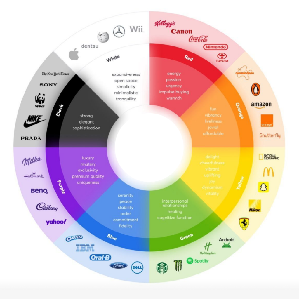
Color psychology studies how colors affect human emotions, behaviors, and perceptions. It explores the relationship between specific colors and psychological responses, such as how red might evoke feelings of passion or urgency, while blue often promotes calm and trust. These responses can vary based on individual experiences, cultural influences, and even age. For example, while white symbolizes purity in many Western cultures, it can represent mourning in some Eastern traditions.
Marketers, designers, and brand strategists use color psychology to create environments and visual experiences that resonate emotionally with target audiences. Color choices can influence purchasing decisions, enhance brand identity, and even affect mood in spaces like offices and hospitals. By understanding these psychological effects, professionals can use color strategically to guide behaviors or create desired emotional reactions.
Here are some symbolic meanings commonly associated with different colors:
• Red: Passion, excitement, and love. It’s an intense color linked to energy and boldness but can also evoke danger or aggression.
• Pink: Soft, gentle, and nurturing. Often tied to femininity, compassion, and calmness, pink can also feel earthy or romantic.
• Purple: Mystery, royalty, and luxury. Purple is often associated with nobility and glamour but can also convey spirituality.
• Blue: Wisdom, peace, and stability. It often symbolizes trust, reliability, and calm, evoking feelings of hope and reason.
• Green: Nature, growth, and renewal. Green is connected to freshness and vitality, as well as stability and tranquility.
• Yellow: Joy, optimism, and caution. It can evoke happiness and warmth but also serves as a warning or danger signal.
• Orange: Warmth, creativity, and enthusiasm. It’s a friendly, inviting color often linked with positivity and energy.
• White: Purity, truth, and simplicity. While it can evoke clarity and innocence, it may also suggest coldness or indifference.
• Black: Power, mystery, and elegance. Black is often associated with sophistication and authority but can also suggest darkness or mourning in many cultures.
These meanings can shift based on cultural and personal experiences, making color a powerful communication tool across design, branding, and marketing.


Color Combinations

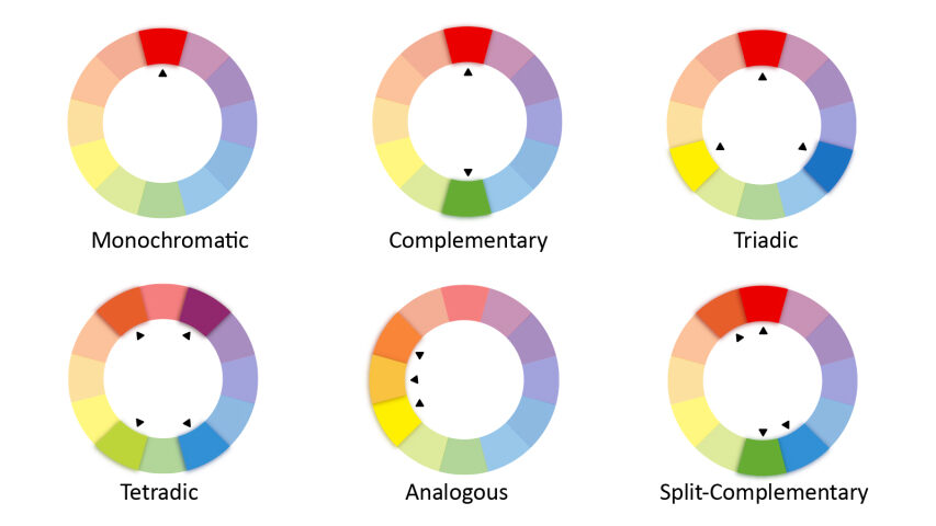
Selecting branding colors and developing a professional style guide is essential for creating a cohesive and impactful brand identity. The colors you choose should reflect your brand’s personality and evoke the desired emotional response from your target audience. A well-thought-out color palette, combined with a clear, consistent style guide, ensures that all branding elements—from logos to marketing materials—work together harmoniously.
A professional style guide helps maintain consistency across various media, guiding designers and marketers in applying your brand colors, typography, and visual elements correctly. It solidifies brand recognition, fosters trust with your audience, and strengthens your brand’s overall presence.
By using color theory and psychology strategically, you can craft a brand identity that resonates emotionally and builds lasting connections with your audience. This approach ensures that every design decision aligns with your brand values and message, enhancing both visual appeal and functionality.
Color Tools
Let’s talk about your brand’s visual identity project and colors.
#colortheory #colorpsychology #brandcolors
